Experience Monitoring
We reissue a revised, corrected, and expanded version of the Paper on Experience Monitoring. The UX Monitor is a tool designed by Sketchin to map, measure and evaluate the quality of experience and analyze actual user behavior.
Sketchin reissues a new, revised version of its paper on Experience Monitoring, a tool for assessing experience and giving design and product management timely information on how to improve it.

We reissue a revised, corrected, and expanded version of the Paper on Experience Monitoring. The UX Monitor is a tool designed by Sketchin to map, measure and evaluate the quality of experience and analyze actual user behavior.
It was 2012 when Michela Perotti and I wrote the first version of the experience monitoring paper. I remember that as a happy time: Sketchin was slowly getting on the path of growth that brought us to where we are now, we had just moved to a new office capable of welcoming us all, and we were starting to think about how to rationalize our approach for designing for the experience.
Meanwhile, after lengthy discussions, we all agreed that we could not design experience because it simply happens in the interaction between people and the world. Instead, we needed to focus on creating products, services, and systems that improve our lives.
Life and experience are, after all, the same thing; life brings with itself several biological dimensions, experience has its own inner space (and who knows if the distinction between mind and nature is actually so relevant...).
On the wall we had - and still have, even if on a different one - an inscription that read: "We want to make people live experiences beyond their expectations." On the other hand, we were developing a design method that was all about evolution.
So we need a tool that could evaluate the experience lived by people and, at the same time, allow a diachronic evaluation, therefore repeated over time, to make sure that our work as designers was going in the direction of the promise on the wall.
Experience Monitoring was born from these premises: a protocol for evaluating the experience of use and consumption, identifying obstacles and opportunities, and giving back to both design and product management a series of practical suggestions for its evolution and improvement.
After almost ten years from its first publication, the tool - to our surprise and satisfaction, remains valid, with some necessary adjustments, and that's why today we propose a revised and corrected edition of the methodological paper that describes it.
Everyone has their mental fetishes - to which one must be indulgent, come on -, and one of Sketchin's is certainly Nobel Prize-winning economist Daniel Kahneman and his experience curves. The Israeli psychologist's studies focus on understanding human beings' choices and their effects, an approach that is split between the humanistic and the economic aspects.
Kahneman used curves to concisely describe and visualize the behavior of investors and economic agents in situations of uncertainty: these are experience curves.
An experience curve visualizes the quality of the experience lived by people and highlights its obstacles and opportunities for development.
It maps the actions that a person has to take to conclude an activity and reach their goal and allows the flow to be broken down into different dimensions: the phases of promise, execution, and conclusion; it can be split more in terms of usefulness, simplicity and pleasantness; finally, its shape clearly shows pain points and win points.
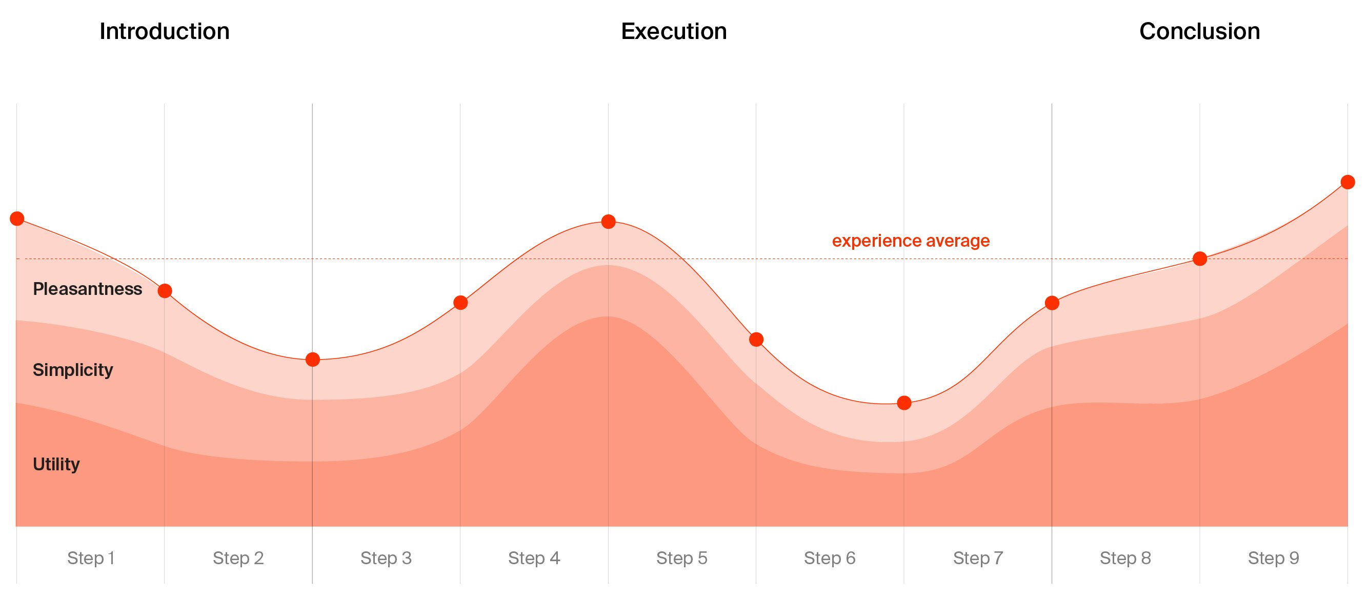
The graph visualizes the experience. It maps the number of actions that a person must accomplish to conclude a task and achieve a goal. The curve displays its composition in terms of utility, simplicity and pleasantness.
We have identified 41 sub-metrics - such as readability, comprehensibility, coherence and affordance - to evaluate the aforementioned elements.
To carry out a Monitoring, the first thing to do is to identify the main flows and contact points with one's clients (whether physical or digital) and identify those with the most significant impact on business objectives. Subsequently, each flow is broken down into individual actions that the person must take to achieve their goal. For each identified step, actual usage/adoption data is collected, and an expert evaluator analyzes the 41 metrics of the experience; each is given a score that indicates, within each individual action, whether the metric is fully met, if an improvement is needed, or if it is absent.
The collected scores are factored in and transformed into decimal-based indexes for comparability, thus allowing an experience curve to be plotted. The curve clearly shows the critical points, or peaks of experience, in the flow, indicating where design actions should focus.
Repeating the measurement over time allows us to appreciate the result of the choices made. In the monitoring sessions following the first, the analysis is carried out on the same flows initially identified, but comparing the new results with those from previous measurements. Thus the difference between the first analysis and the subsequent one, in terms of user experience and usage, is measured.
The analysis is carried out by an evaluator who critically analyzes the flow performed by people to identify critical issues and opportunities for development. The expert examines the UX curves, describing the characteristics of the conformation and identifying a series of insights and suggestions to improve the experience offered.
The evaluator interprets what the measurement illustrates. Nothing tells us what causes a critical point in the experience flow; the critical analysis conducted by the expert highlights the causes and thus makes it possible to direct corrective actions.
Nevertheless, there is a dose of subjectivity in carrying out the monitoring, and therefore of arbitrariness. However, this does not mean that the measurement is not valid or is fallacious (I do not want to disturb anyone, but even medicine is mainly based on observation and an expert's judgment: there is a fair amount of arbitrariness even in a diagnosis).
Finding an objective measure for experience is impossible; no scale nor meter holds. However, it is possible to think of indicators - the 41 metrics - that can estimate its quality. A complex construct can be broken down into more specific concepts, which, in turn, can be broken down into others that are even simpler and more observable, and so on, until a matrix of indicators is built that, all together, contribute to defining the original construct.
The real strength of such a method is the ability to estimate the quality of experience, interpret behavior and understand the causes that generate them.
Experience monitoring is a partial evaluation of certain moments considered critical (pain points) of the Customer Journey, which emerge from research activities. Therefore, they are based on well-substantiated assumptions derived from the analysis of a portion of customers and conducted by expert evaluators who interpret the data in their possession to provide management with a snapshot of the situation so that the necessary actions to improve it can be established.
However, as effective as the monitoring can be - and it is -, it only affects a few of all the possible experience streams in the interaction between a person and a service, a product, a system. It selects only some of the Customer Journeys, and for these, it offers relevant interpretations.
Many of the relationship paths between consumers and the company in their integral view are hidden, often overlooked, or ignored. To overcome the limitations of traditional Customer Experience measurement, it is now possible to leverage the potential of Machine Learning and Artificial Intelligence to apply them extensively to the entire set of Customer Journeys and thus map as many interaction-related phenomena as possible.
But that's another story for another time.
In the meantime, you can download the full paper that tells the story of the tool, how we conceived it, and its benefits for designers and the management. Enjoy your reading.