Sketchin

A new hybrid learning experience

By redesigning the online experience, 24ORE Business School has evolved its visual image, simplifying the use of its website and increasing conversion.

24ORE Business School learning platform on laptop tablet and smartphone

By redesigning the online experience, 24ORE Business School has evolved its visual image, simplifying the use of its website and increasing conversion.

Industry

Education

Year

2021

Client

24ORE Business School

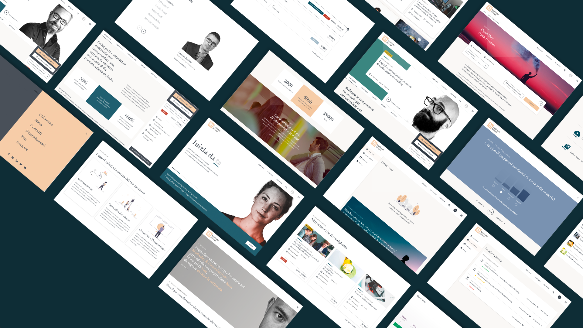
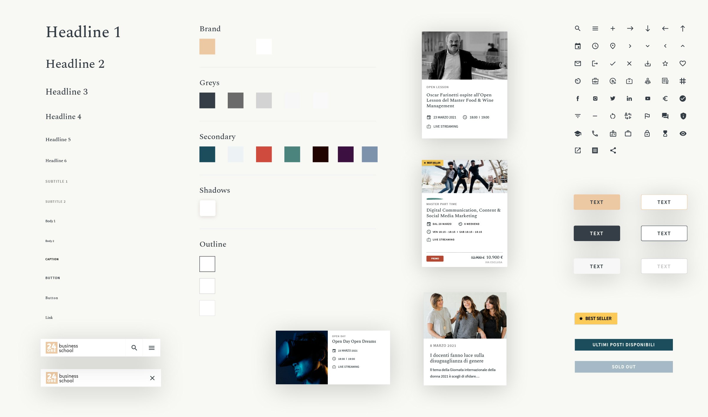
Redesign of the educational ecosystem

The challenge for 24ORE Business School was to rethink the educational ecosystem to deliver an all-around experience for the entire offering spectrum and provide a fluid use of physical and digital space.

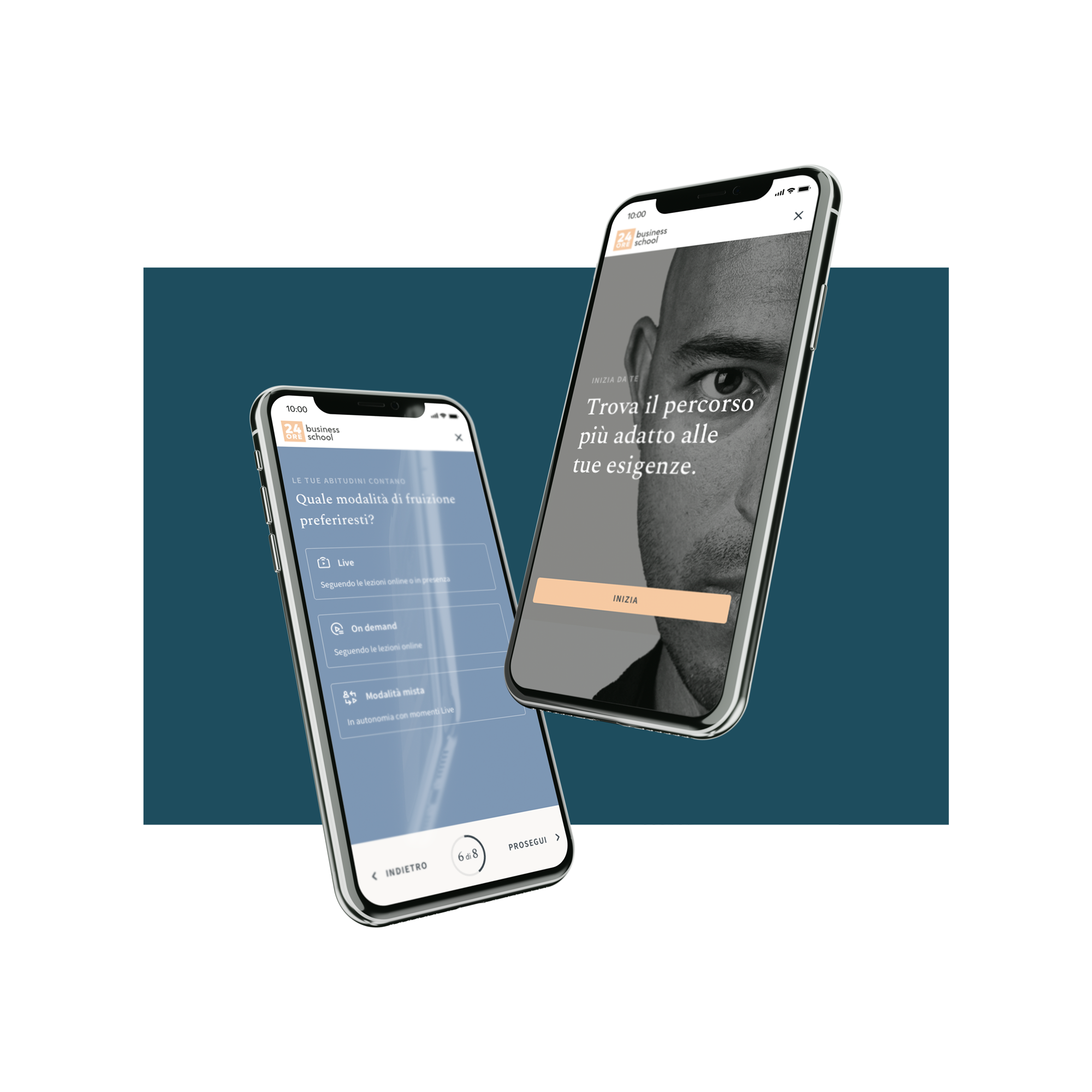
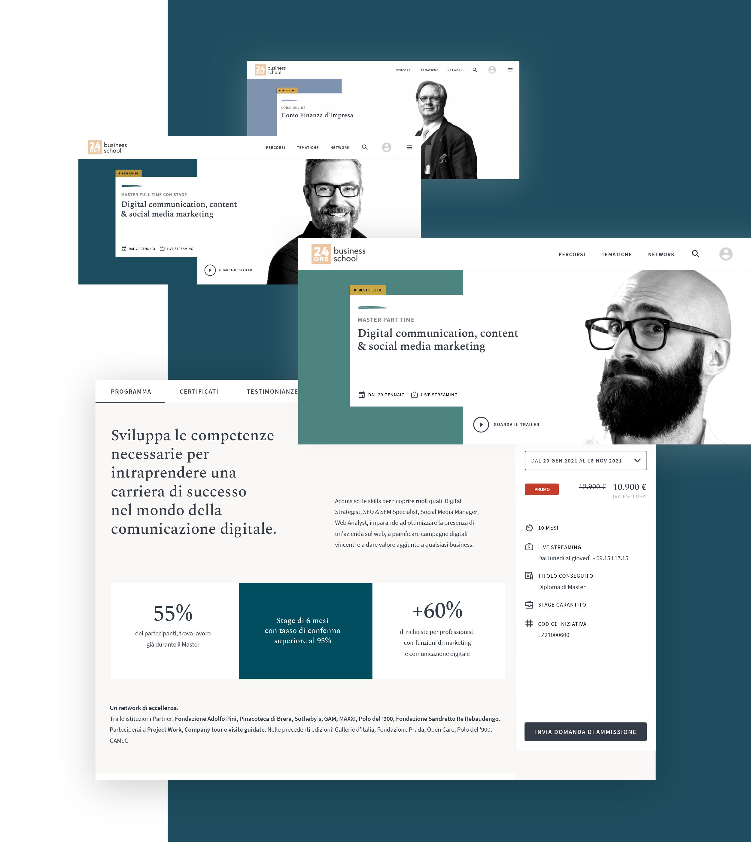
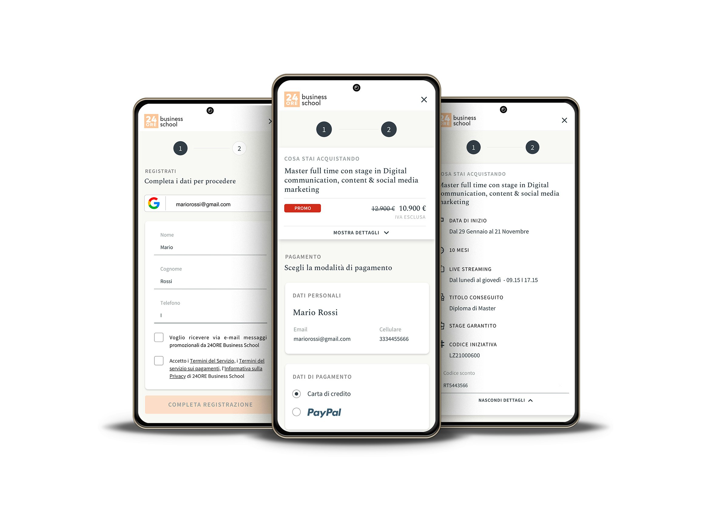
Besides the research, we focused on redesigning the website to improve the visual identity, optimise the sales funnel, and improve the lead generation through a simplified profiling system, that helps people find the best training path.

Overview of main desktop user interfaces for the 24ORE Business School educational platform

Outcome

In 14 weeks we completely re-designed the responsive 24ORE Business School website, integrating a new profiling and advanced search system. The onboarding process, including a Welcome kit for teachers, has been redesigned, together with the personal area, applying a new, distinctive and consistent visual identity.

single steps to complete the purchase
2
new initiatives for teacher onboarding
20+

An easier search increase the leads

In order to meet business needs, we have designed a profiling system ("Profiler") that helps people find the most suitable training course for their needs. 

By answering a few questions, it is possible to view the educational paths available and the masters courses most in line with the user's needs, receive the results by e-mail and in the personal area, and therefore purchase one of the suggested products even at a later time.

Through the data collected by the profiler, it is possible to offer personalized results and purchase bundles, opening up the possibility of upselling and significantly improving the conversion potential.

Design of a profiling system that helps people find the most suitable training course for their needs. 

A clear, modular and recognizable offer

Given the large number of products offered by the 24ORE Business School, we have simplified the filter system and reorganized the offering to give the users a complete overview, guiding them through the choice of the training path closest to their needs.

The structure of the training offer has been designed according to a modular and scalable grid that summarizes the most relevant information, allowing the user to easily compare the information of the different courses and/or masters of interest.

To ease the user understanding of the different product types (e.g. full-time masters, part-time masters, etc.), we have matched each product with a distinctive color code that stands out clearly throughout the entire online platform.

Alongside the UX/UI work, we worked on a clear and straightforward storytelling that could guide, at the same time, both professionals and recent graduates.

Educational offering designed according to a modular and scalable grid.
Educational offering tablet visualization to guide users through the choice of the training path closest to their needs.

Just two steps to check out

The purchasing process has been lowered down to two steps: first, the user logs in or registers (also via social login), then he pays via the main payment methods. 

With the aim of guiding the user at every stage, we have introduced the product summary, accessible at any time: it allows the user to have an overview of what is being purchased, to manage and choose the starting dates and the active offers.

Simplified purchasing process with just two steps to check out

Zeroing the distance between design and code

All interface components have been implemented with the Svelte framework within a design library, enabling a modular UI and a simple integration on the customer's systems.

The continuous dialogue between the Sketchin UXEs' skills and those of the 24ORE BS team allowed a further improvement of the solution during the development phase, bringing online a code consistent with the design, optimizing the overall user experience, the responsiveness of the site, its future scalability, the conversion funnel.

Selection of UI components implemented in the design library

With the redesign of the entire online educational ecosystem, people are now at the center of the experience, thanks to a new visual identity and engaging storytelling. Physical and digital become complementary, and advanced profiling translates into benefits for users and for sales, improving lead generation and conversion of those who choose to invest in their future.

Project Numbers

designer del team Sketchin
2
weekly iterations
14
involved stakeholder
25+
interviewed final users
20+
visual mockup
150+
design library elements
700+

Get in touch

Learn more about our projects and what we can do for your business.