Sketchin

A new brand for a natural beauty

We have helped Ticino Turismo develop and expand a new brand ecosystem to witness the very essence of the district.

We have helped Ticino Turismo develop and expand a new brand ecosystem to witness the very essence of the district.

Industry

Travel & Tourism

Year

2018

Client

Ticino Turismo

Roots of inspiration

We are particularly fond of this project. Our studio was born in Tessin, and we are always aware of the beauty that surrounds our headquarter and works as a source of inspiration for us. This is why we were thrilled when we were asked to redesign the brand of Ticino’s Tourism Agency.

The importance of Ticino as a tourist destination has increased during the last few years, and now it is visited by people from all over the world: Americans, Russians, Asians…

They may stay for a day or an entire season, and they come for a lot of different reasons: to appreciate the beautiful landscapes, to practice sports, to join the music festivals, or merely to live “La Dolce Vita” from the Swiss side of the border.

Visit website
iF Design Award 2019 Winner

Outcome

Ticino Turismo evolved along all the different variations of its brand experience becoming a new, modern and adaptable mark. Its new ecosystem is flexible enough to fit different shapes, channels, touchpoints and contexts of use.

Ticino as a brand found a new way to reach its visitors and meet their needs and different experiences.

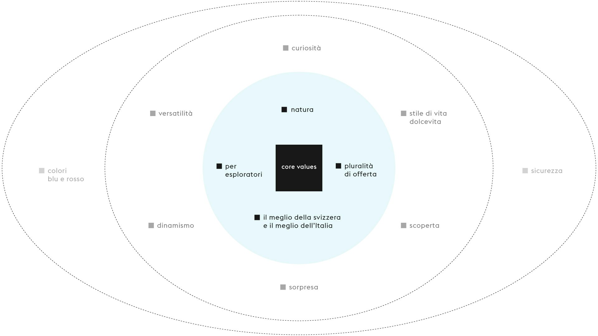
During the research and co-design phases, we discovered some unique values of our district that we infused in the new brand identity.

of revenues
22M
new active users on social media
102K
new user-generated content
1.1K

Small moments, a great experience

The essence of the brand is the essence of Ticino and the brand is accordingly condensed in the tagline that goes along with the mark:

Small moments, a great experience.

The Ticino Canton is plural; it doesn’t have a unique peculiarity: its essence comes from a multiplicity of moments, micro-experiences scattered in the region that forms a picture of rare beauty and charm. That’s why we have chosen the metaphor of the mosaic: many small and colorful tiles that give shape to an image.

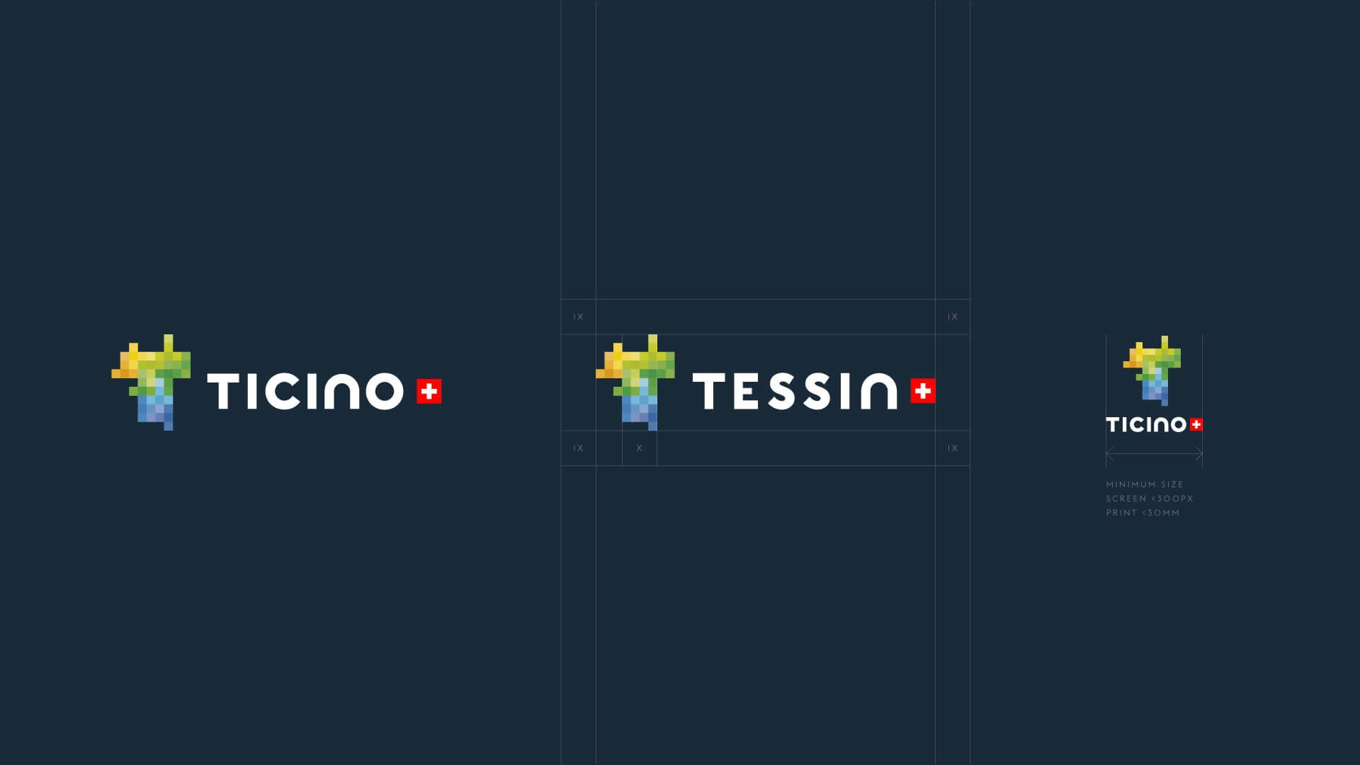
The new brand derives entirely from the concept of micro-experiences. The logo is an irregular T and its configuration resembles Ticino’s geographical shape. The logo is made by many colourful tiles of different shades that compose a mosaic and convey the idea of a vibrant and multi-faceted place.

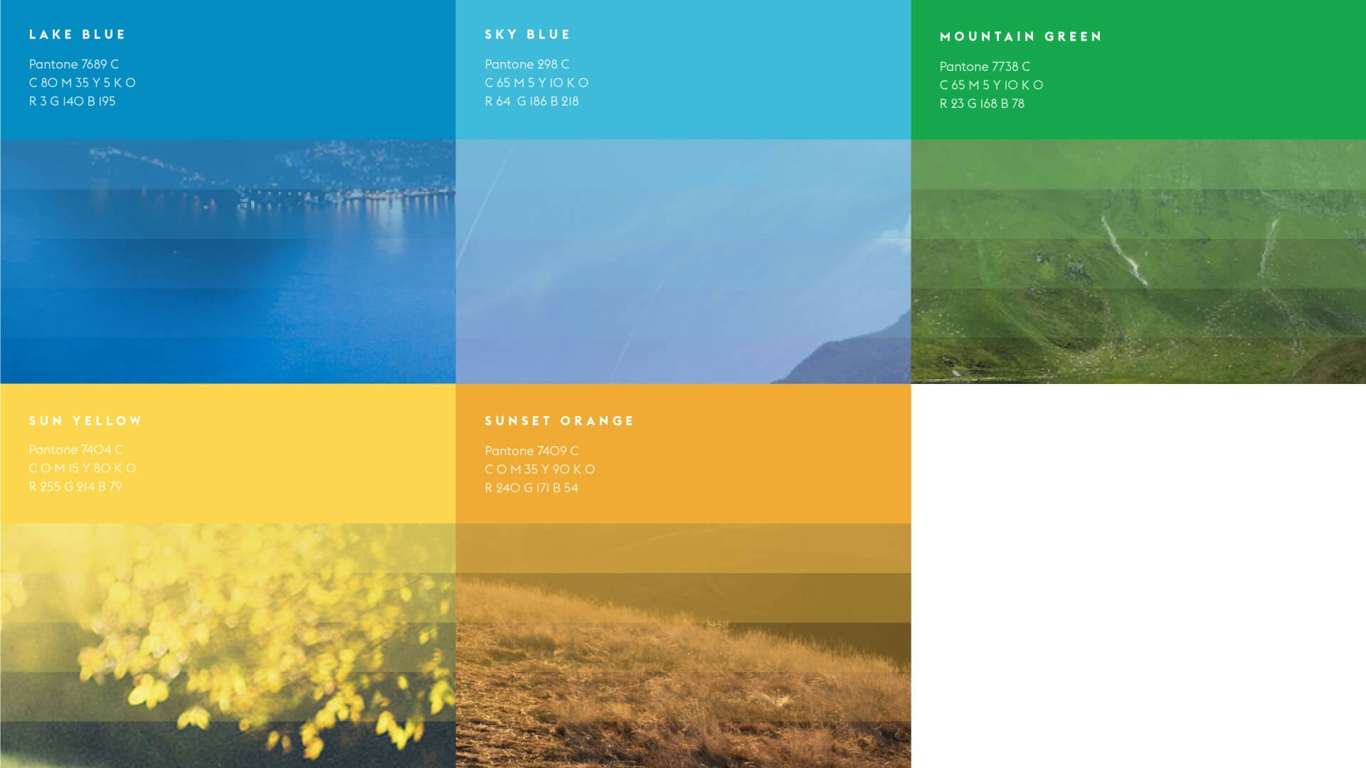
The colours are those that people can see while visiting the district: blue and green for the lake, the forests and the sky; yellow and orange for the sun and the sunset.

We got the inspiration also from the people we met during the research phase and from the heritage of the touristic communication of the district.

We were also inspired by the posters designed by Romano Chicherio, Daniele Buzzi and Orio Galli between the 30s and the 70s: those images show how this beautiful Region has always been represented through its vibrant colours.

Moments of feeling

Micro-moments

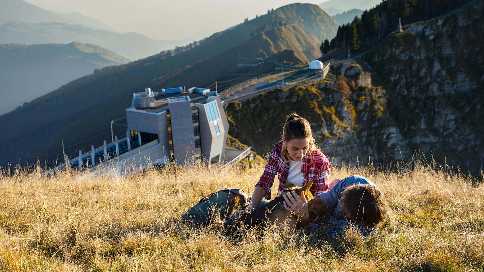
In Ticino, visitors may stumble upon many secret spots and live extraordinary experiences that will remain in their memories forever.

Ticino feeling

The Canton of Ticino has a unique flavour that makes it stand out from the rest of Switzerland: it provides a taste for life that resembles La Dolce Vita.

Far from the widely-known routes

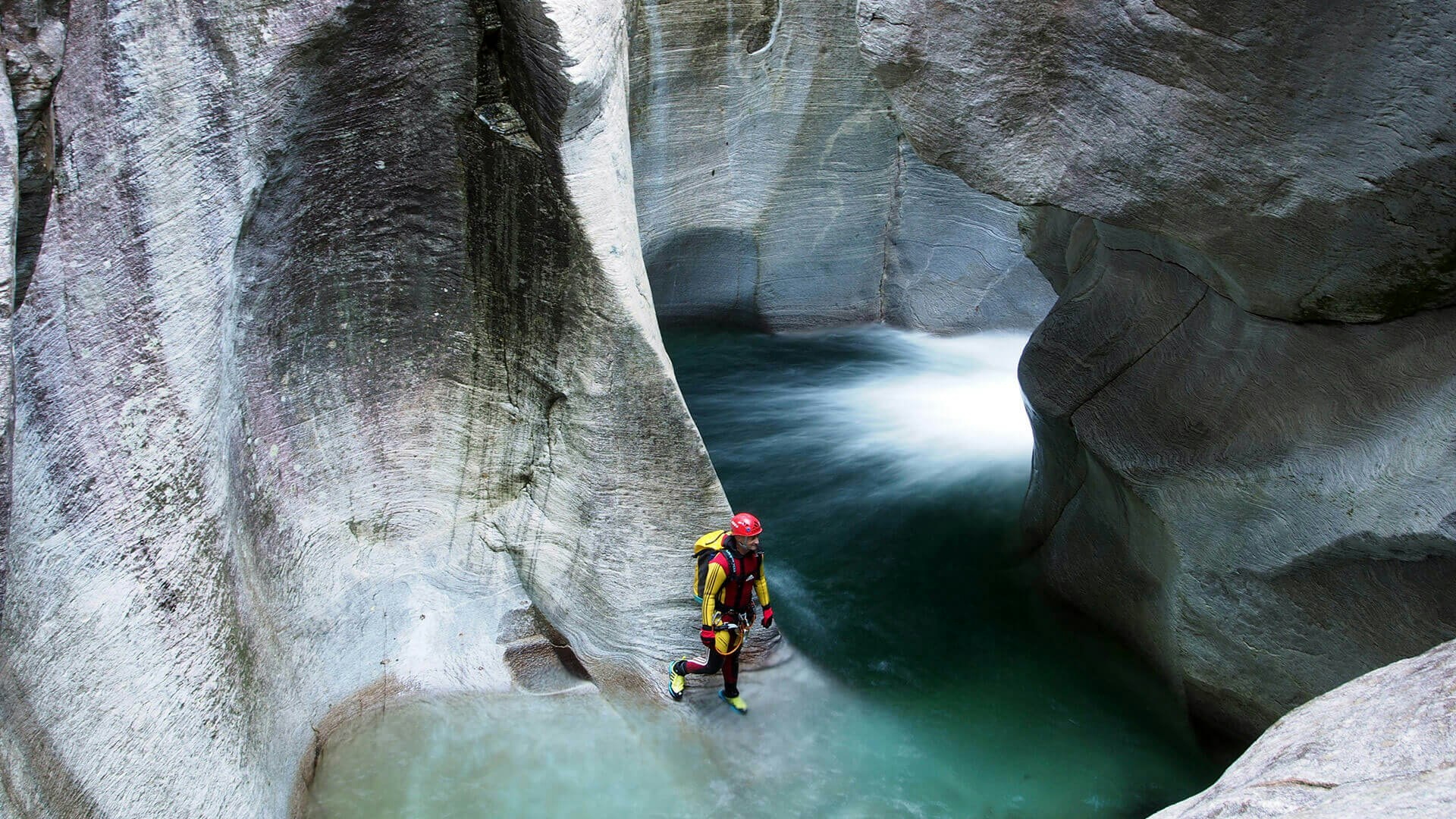
Ticino is for explorers: it is sufficient to abandon the central itineraries for the traveller to live thrilling adventures and intense emotions.

The mix of these three factors is what tells the diversity that Ticino can bring if compared to the universe of tourist destinations. Within this framework, many other distinctive aspects contribute to moulding the identity of this region:

An excellent culinary and wine-growing tradition:

  • The warm character of the locals
  • The Mediterranean lifestyle
  • The breathtaking beauty of the landscapes
  • The most extensive network of hiking trails in Switzerland
  • Many cultural events

Ticino and its identity are:

  • Authentic: connected with its heritage and territory
  • Different: multiple, multi-faceted, colourful
  • Amazing: it dazzles visitors evoking great emotions
  • Carpe diem: there are many small special moments to experience and share

Eight design pillars to define an ecosystem

The new brand identity of Ticino Turismo derives from a set of characteristics that also define the entire communication ecosystem:

The brand is thus:

  • Iconic: it is memorable and recognisable in its claim as well as in its graphic composition.
  • Narrative: it supports multi-level storytelling and promotes the identity of the region.
  • Digital Native: the brand identity supports all the digital apps natively.
  • Empathic: it addresses people directly, stimulates emotions and adds value to the storytelling.
  • Future-friendly: it is flexible and it can adapt to an ever-evolving context.
  • Pervasive: it can reside in different media channels and touchpoints.
  • International: it conveys the DNA of the Canton to all visitors.
  • Inclusive: it fits smoothly into the local and national tourism ecosystem.

Developing the brand strategy

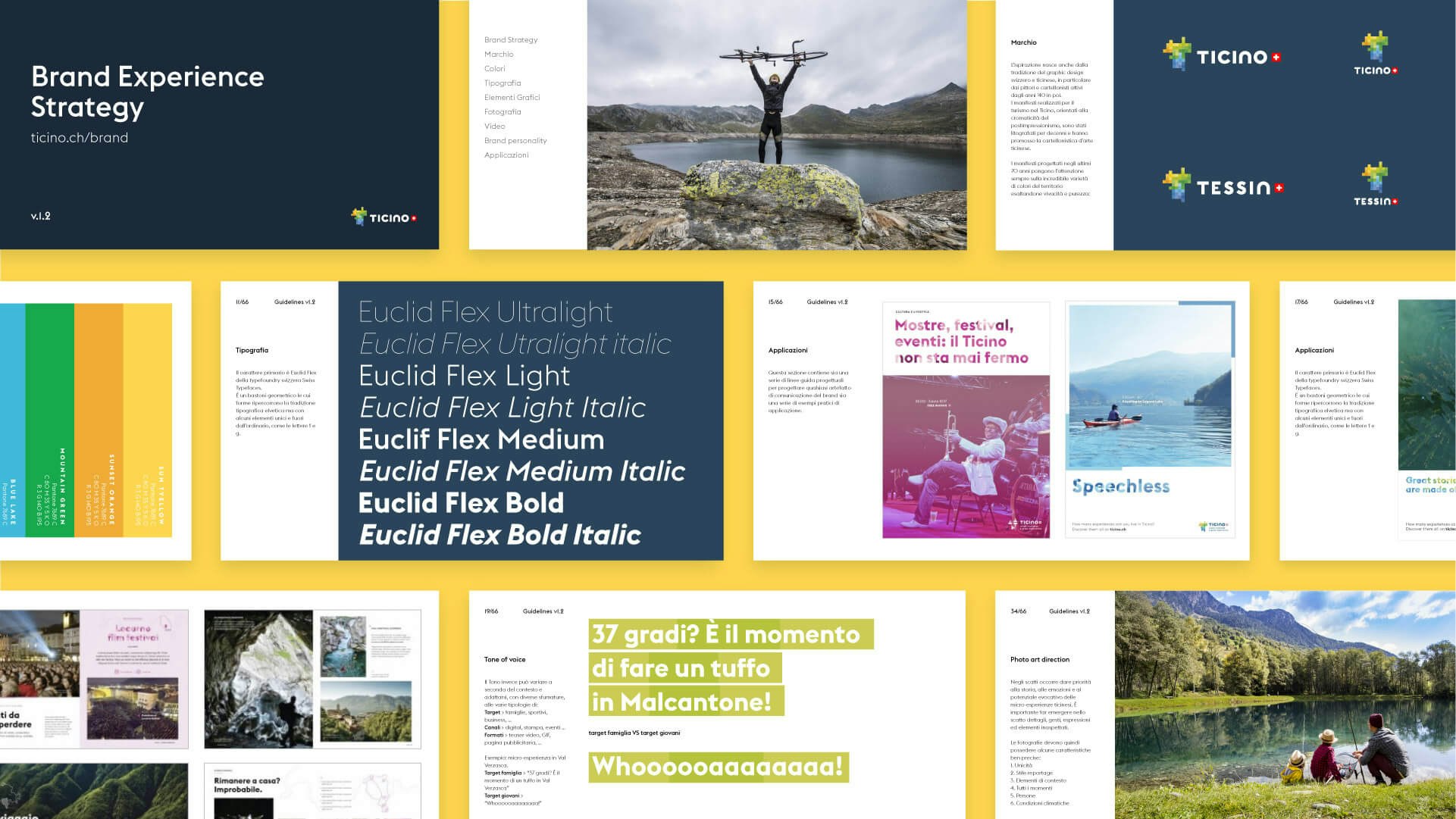
From this initial concept, we derived the entire Brand Experience Strategy, its pillars, and its guidelines. 

The strategy impacts on the experiences and emotions that tourists live while visiting the region and while meeting locals. Micro-experiences are the focal point of the new brand strategy; they represent the fundamental component of the storytelling and convey the unique beauties of Ticino.

Many touchpoints for a unique experience

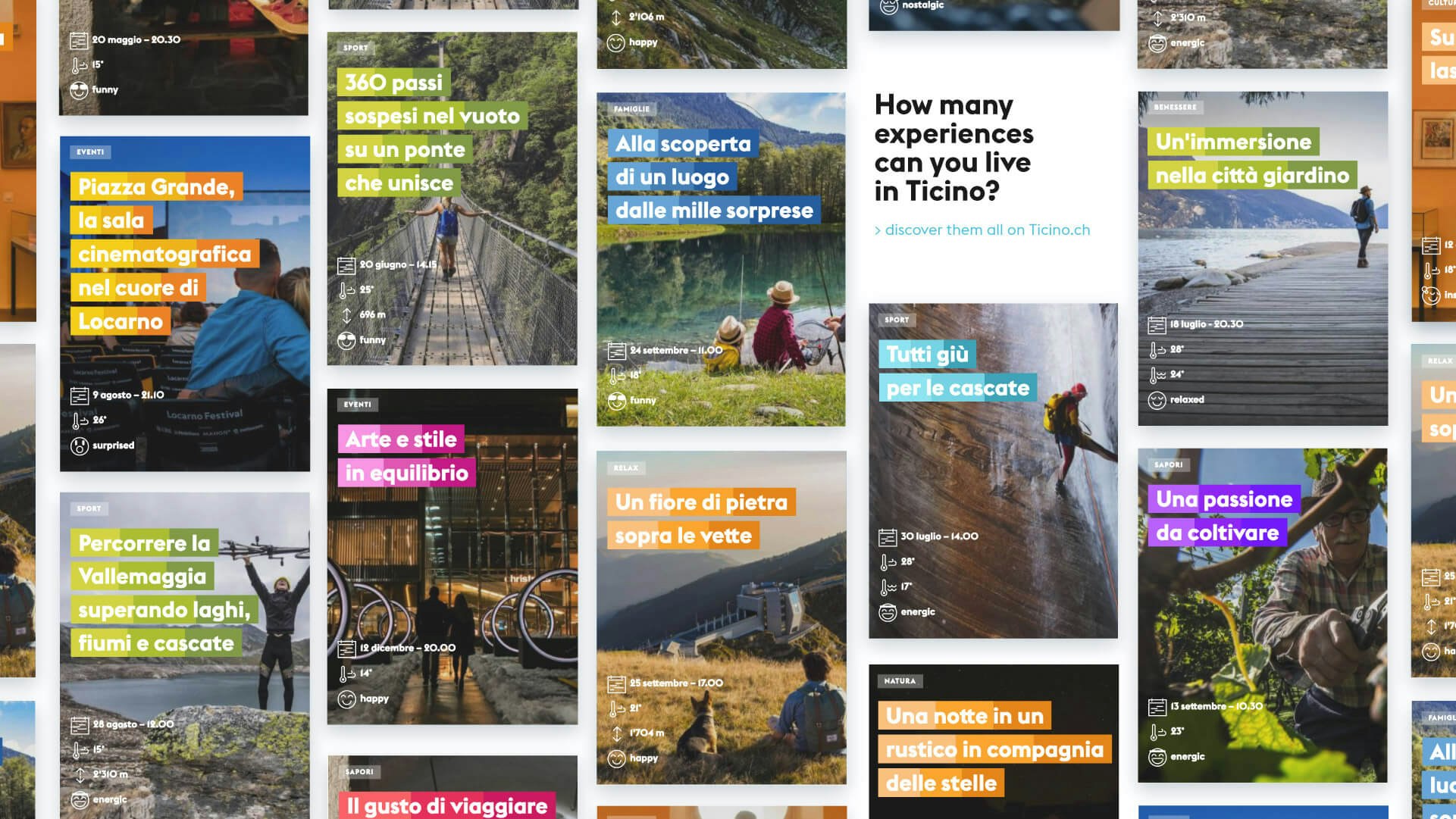
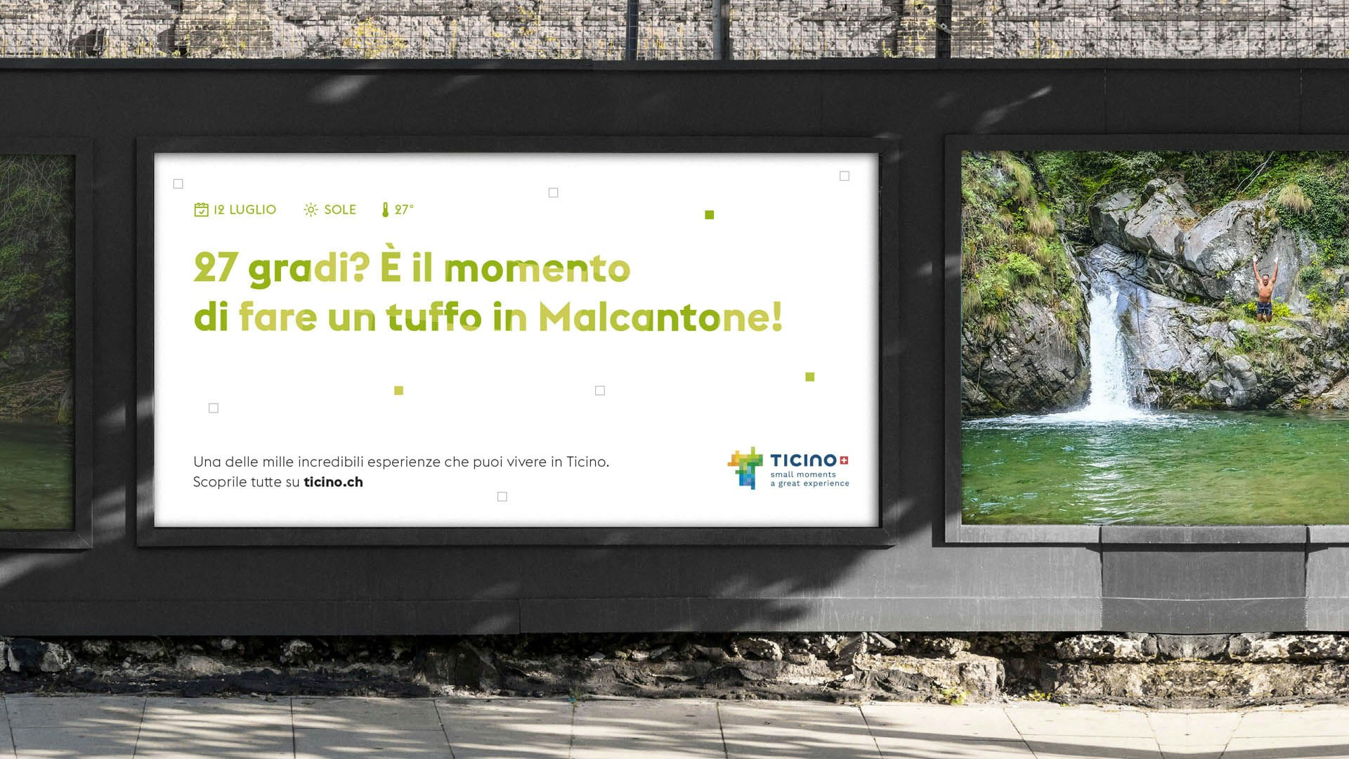
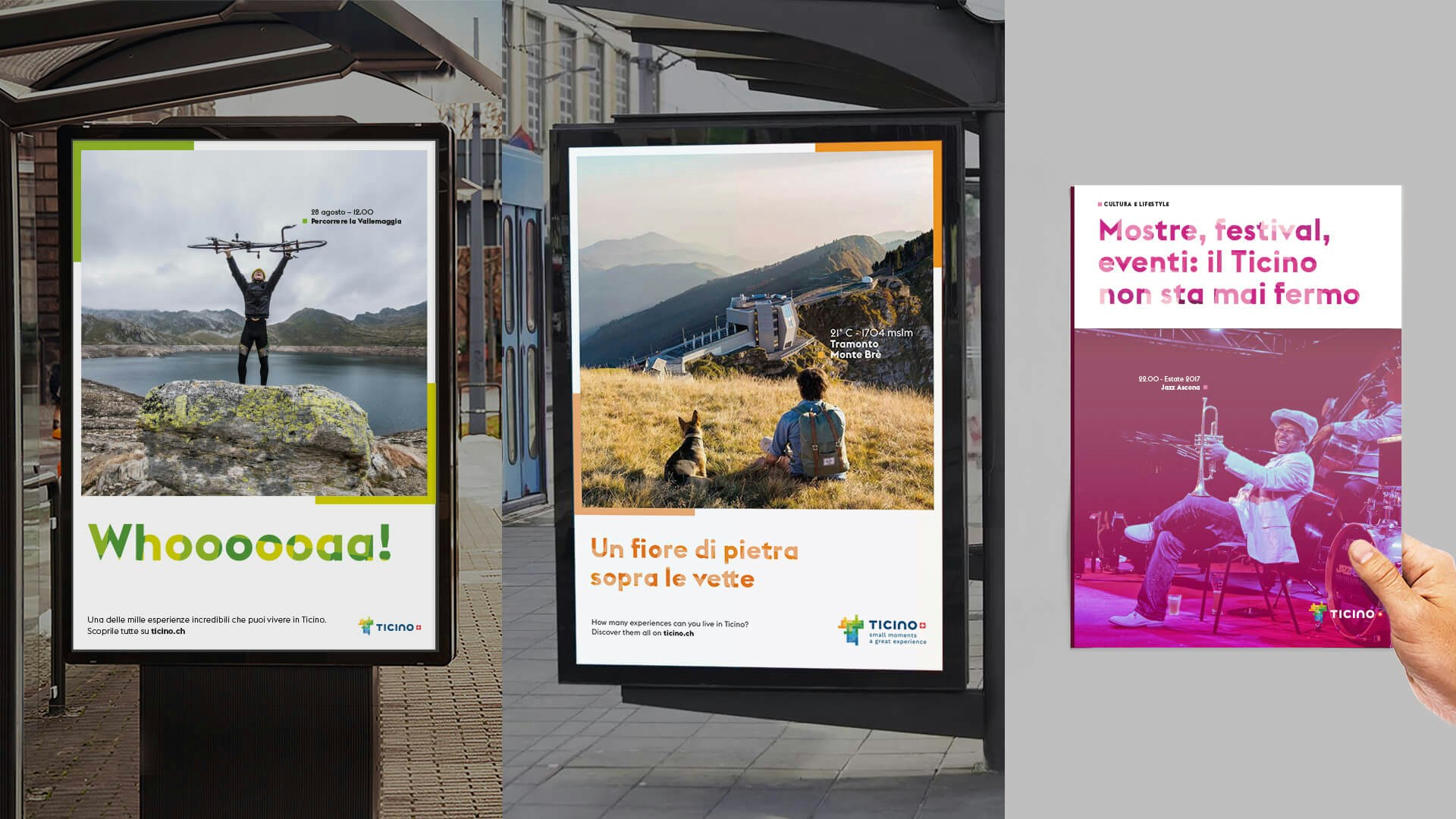
We have applied the new brand identity on many other supports, both digital and physical: the website, the new magazine, the posters and the merchandise.

A tone of voice to inspire, advise, intrigue

The new Ticino Turismo tone of voice changes according to the context, target, media and touchpoints. Ticino Turismo is an institution made of people who care about their region, and this is why it speaks in the plural form. Its primary goal is to promote the Canton and its beauties: so its language is plain and colloquial, and it invites to communicate with visitors.

Portray the experience

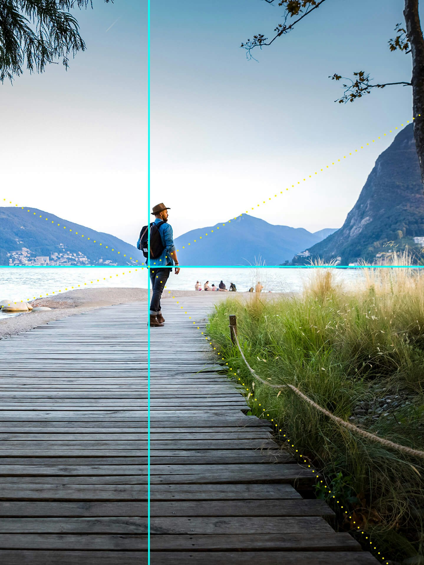
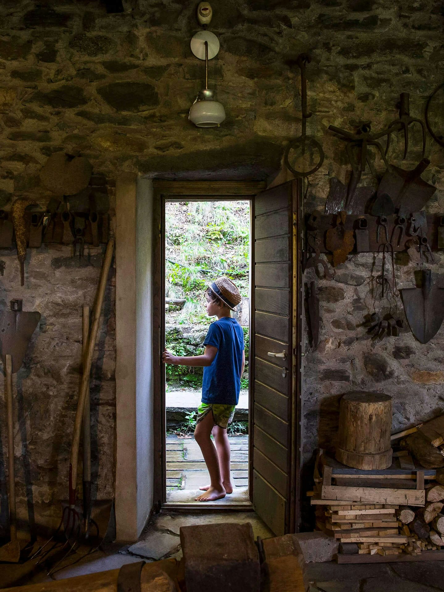
The images must show stories, emotions and the evocative potential of places. Each photo should focus on micro-moments, details, gestures, expressions and unexpected elements.

A video leap into nature

To better represent the metaphor of the mosaic, the videos mix takes into account the local context and details; sometimes the rhythm of the scenes slows down so the visitor can live the moment and appreciate it. We chose to underline Nature’s sounds by sometimes allowing them to be louder than the soundtrack.

Video credits: truecolor

The new brand identity of Ticino Turismo is more than a logo: it comes to life thanks to a multitude of coherent elements, each one conceived to create an engaging storytelling for a wonderful Region.

Project numbers

months of work
12
designers in the Sketchin team
7
tourist operators involved
150+
local agencies involved in the project
Four
photographers and videomakers involved
10
envisioning and co-design workshops
Six

Get in touch

Learn more about our projects and what we can do for your business.